{19 }Natural Beauty

PI3-1-AD

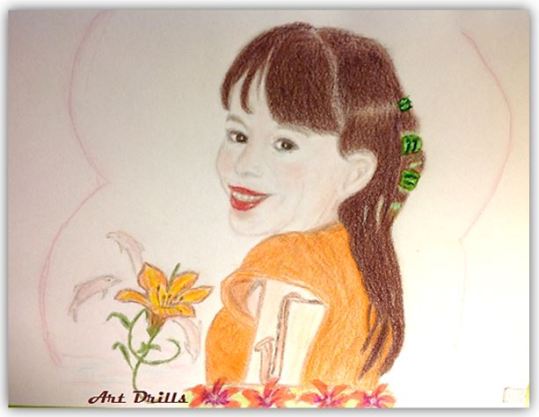
Beautiful Rich Natural Features – No Artificial enhancements
~ ~ ~ ~ ~ ~ ~ ~ ~ ~ ~ ~ ~ ~ ~ ~ ~ ~ ~ ~ ~ ~ ~ ~ ~
Not a frequent cosmetics user – no need for any either.
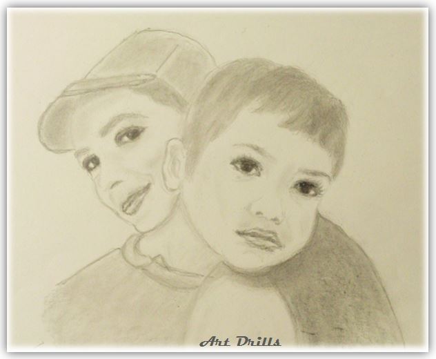
Same goes for her Sister
Both could send cosmetics companies broke, Lol!

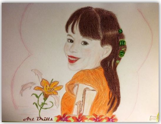
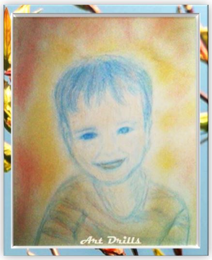
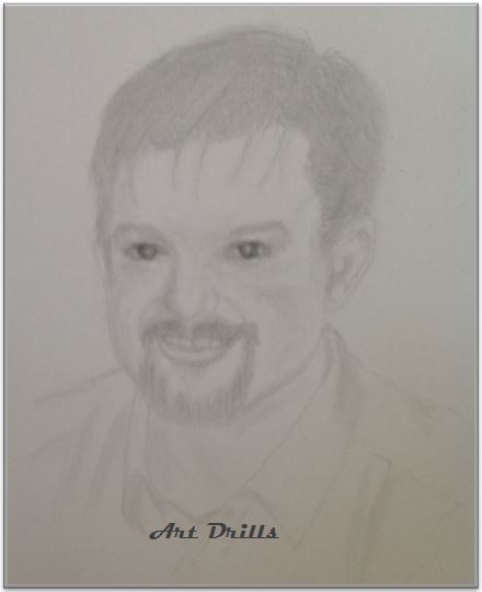
It started with great potential

PI3-2-AD

but then i got very sick, my brain turned totally blunt
losing all sense of lines, colours proportions, dimensions, and all
my hand working blindly with no internal guidance
so i lost it all several times – gave it up twice and started a new outline
Still way too sick to make any progress, i kept going back to this
until the paper started screaming and groaning
and in the end, after so many repetitions and alterations
my brain was reconditioned into seeing what i would like to see
and could not judge anymore how true, close or far from original.

I decided to complete it and then leave it, being as it may.

PI3-3-AD

So …here it is … but still cannot tell …

PI3-4-AD

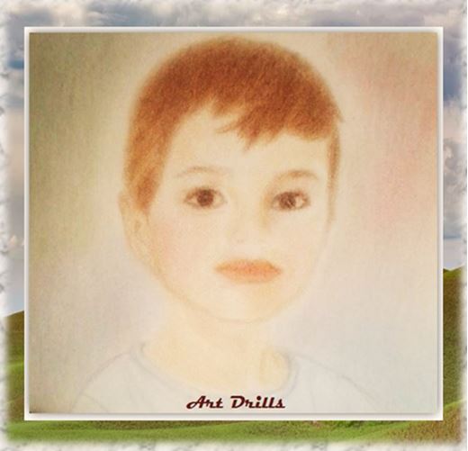
Independently does not look too bad

PI3-5-AD

And certainly way better than the initial attempt
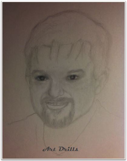
when i first started a couple of months back.

PI1 -GR1 -AD

The idea actually was to present a better version of the initial ones
i felt had been disadvantaged by my beginner’s inexperience.

~ ~ ~ ~ ~

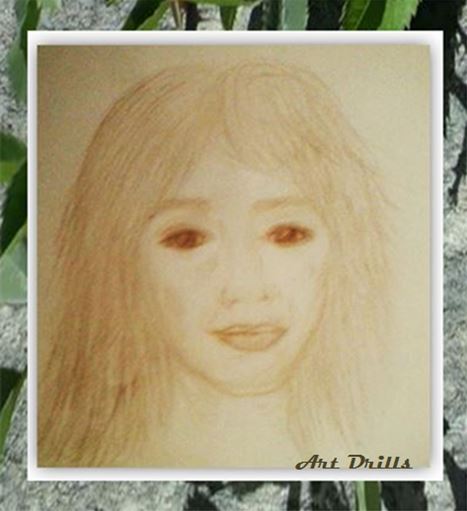
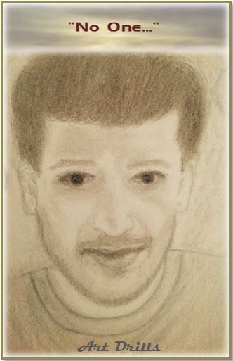
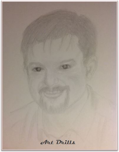
Some imaginative Software Play

PI3-6-AD

Looking at the finished one i can see a couple of Angle / structural
mistakes needing correction. An experienced artist would spot them
immediately but … i m not telling on them, Lol!
It is all a learning journey…

{18 }Thoughtfully Focused

PR3-1- AD

Thoughtfully Focused and handsome like a Prince.
~ ~ ~ ~ ~ ~ ~ ~ ~ ~ ~ ~ ~ ~ ~ ~ ~ ~ ~ ~ ~ ~ ~ ~ ~ ~ ~ ~ ~
I Love the slightly pouty expression of his perfectly shaped Lips
and the intensely Focused Thoughtful Expression of his Eyes.
He does not look sad or angry but rather deeply engaged
in observation of something going on/someone doing something?

PR3-2- AD

It was neither simple nor easy capturing this expression
but i believe after several corrections of eyes and lips
and after at some point resigning to accepting it as undoable
i finally managed to succeed to a great degree

PR3-3- AD

This lifted my spirit and helped continuing on with more zest

PR3-4- AD

Below Three Brightness /Contrast versions of the Final one.
The Pinkish/Blue Background is not software manipulated
but rather deliberate ‘clever’ advantage of Lighting in the Room.

Very Light Version – Many features almost washed out

PR3-5A- AD

Slightly Darker – Some Features brought forth

PR3-5B- AD

Much Darker – All features quite prominent

PR3-5C- AD

The copy below IS a Software Play!

PR3-5D- AD

{16}: Bright and Beautiful

PKT AB1-AD

Beautiful, Highly Intelligent and a Great Achiever
~ ~ ~ ~ ~ ~ ~ ~ ~ ~ ~ ~ ~ ~ ~ ~ ~ ~ ~ ~ ~ ~ ~ ~ ~ ~ ~ ~

A shaky start as usual

PKT B1-AD

PKT B2-AD

Not sure what was causing the light contrast in the room (Below)

PKT B3-AD

I tested and used what looked light Pinkish gel pen for the Lips
but it came up much brighter and deeper red than i intended

PKT B4-AD

Completed T-Shirt drape, folds and look

PKT B5-AD

Added some features meaningful to the young lady

PKT B6-AD

Nice as they are i was not sure the Dolphins tied with the theme
So i erased them and replaced with a Tiger Lily
but… i could still see their outline underneath
and i knew if i could see them, the camera would pick them up!
So… i decided to incorporate them into the design

PKT B7-AD

A pseudo frame to bring the Focus to the center

PKT B8-AD

And finally a Photo taken from that Elusive ‘Right Angle’
that shows how it Really looks on the Sketch Pad
i.e Clear Focus and the Right Tilt of the Head and Body etc.
Compare the looks of the photo above with the one below.

PKT B99-AD

Incredible isn’t it? …As if she just moved her head back
I bet if i combined both photos in an animated gif
it will look exactly as if she moves her head back and forth.

A darker version bringing forth some of the features
(while overstating others – cannot have both as they truly are)

PKT B9-AD

And to prove the camera tilt point i tried the gif animation

output_UKSoYf.gif

{17}: Little Sprout

PL2-1 -AD

Beautiful intelligent Piercing Eyes – Humongous Black Pupils
Sprouting from the ‘Jolly Little Buddha’ to a Little Big Man!
~ ~ ~ ~ ~ ~ ~ ~ ~ ~ ~ ~ ~ ~ ~ ~ ~ ~ ~ ~ ~ ~ ~ ~ ~ ~ ~ ~ ~ ~ ~ ~ ~ ~ ~ ~

His hair –at least in the photo – is not Brown nor is it Blond
but rather sort of Smoky Gold, and i have nothing remotely
near it in any of the colours in my pencil sets
so that’s the closest representation i could achieve.

PL2-2 -AD

There is also no visible light reflected in the eyes in the Photo
-the Pupils look like two humongous delicious Black Plums-
so i had to guess where to allow some, so they would’t look
like flat buttons in the sketch and was happy with the way
it accentuated the happy expression on his face.
I was tempted but reluctant to round them a bit darker
in case it dulled the expression and made it look sad or severe.

PL2-3 -AD

Other than the closest Likeness of the Face
I chose -not to focus on faithful detailed photo reproduction
which i find a too tedious and limiting task for my purpose
and pleasure and often at the expense of Expression

PL2-4-AD

I added cute child themes easy to scribble
and in small proportions, so that they enhance
and draw attention to the face

PL2-5 -AD

I also went light on colour with this one, i thought it suited best.

PL2-6 -AD

I must confess much like in this project
i often find myself torn between two extremes:
On one hand I seem to like the initial minimalist look
when only a bit of Facial colour has been added,
against my equal liking lavish richness of colour.
I find the minimalist look has it all and allows
the Brain to fill the gaps and compensate for any
missing details much like it does with photos
while the more colour details added though in a way
they get to complete the picture, on the other hand
they seem to add and subtract elements
while turning the brain to its more critical function
of spotting the ‘missing’ or … ‘distorted’.
Add to that the angle a photo is taken
and a few more elements are haphazardly added or obscured.

To illustrate what i mean:
1) The First Photo shows a cute, bright, happy little face
Second photo the hair colour added takes away some of it
and looks more grown and more serious.
2) In the Third, the angle the photo is taken
it portrays a potential future 16 year old teen

Of course even in real life faces often show hints
of future ages and development
so i can forgive this and … marvel! 🙂

{15}: Elegance

PKT 1-AD

A Budding Exotic Beauty like a Flower in Spring.
Elegance is now Prominent in her recent photos.

~ ~ ~ ~ ~ ~ ~ ~ ~ ~ ~ ~ ~ ~ ~ ~ ~ ~ ~ ~ ~ ~ ~ ~ ~ ~ ~ ~

I would like to say that i was Inspired by a Photo
in order to save face but it would only be partly true.
What really happened, is that after a number of attempts
on capturing likeness and the youthful wonder
in  her eyes and smile, proved impossible, as well as
several mistakes difficult to erase  along the way
i decided to abandon it and start a different one.

When i declared so, my Man looked at it thoughtfully
and said: ‘If you do not compare it to the photo,
it is not too bad at all, in fact it’s nice as it is.”

PKT 2-AD

This caused my Brain to switch to a different mode
and gave it another appraisal for its own merit
assessing the possibility of any independent improvement.
So i started working feverishly and having nothing to lose
i jumped at the opportunity to use colours again
and experiment with Felt Pens.
One problem with FPs is that once a line is drawn it cannot
be erased – which i realised after  re-touching the eyes…

PKT 3-AD

Despite this change, i thought strangely it had now started
to look more like the photo than at any previous stage.
A slightly improved facial expression though still not joyful
and still wanting in Likeness due to new non erasable FP lines
but had to do something to cover up the mistakes
– so i became a bit … ‘creative’…

PKT 4-AD

Some visible and some obvious but that’s the best i could do.

Now … …. Please…Please… Please!…

Beg

Unless they blind your Retinas
Do not try to guess or detect them!

PKT 5-AD

In the end there was a Redeeming whisper in my Brain:
“Perhaps in another 3-4 years this will be closer to reality”

{14}:An endearing tender moment

PZIF-1-11

She is a Beauty with Deep Dark Eyes and Enigmatic Smile.
He is a sweetie with Gorgeous Facial Features.
A bit upset in this instance? Leaning on his Mum’ s shoulder.
An endearing tender moment.

An absolutely Stunning Black and White Photo
Rich, Bold Black Lines and Shades
with equally strong contrasting Light areas.
It captured my heart the moment i set my eyes on it
and instantly felt an overwhelming desire to sketch it.

A rather ambitious and quite unrealistic one,
more like a dream really but here i am after all
trying the impossible and tried to reproduce as much
of its richness as i could with just my 3B Pencil…

PZI-1-1

The iPad autofocus of camera in the photo above, shows
the Boy’s face more prominently and his Mum’s smaller
while same photo below taken from a slightly different angle
shows Mum’s Face larger and equally prominent
truer to the Photo and Sketch.
If only i could pinpoint that angle for all following photos! 🙂

PZI-1-11

Nevertheless, this was not done as an Art Drill
but for the personal pleasure and fulfilment of that desire
so what follows from here on is my own imagination.
Now since i could not reproduce the Richness of the Black
i was torn between the Pure Perfect Simplicity in its own right
and my need for Colour – a touch of colour without detracting
or stealing the show from the Centerpiece.

And here comes the touch of Colour

PZI-2-1

I still felt something was missing before declaring it completed.
Here i confess if i had thought of the addition made below
before adding the touch of colour i would have been satisfied
with the perfection of Simplicity and left it at that
but on a Sketch pad there is no ‘Undo’ key and erasing
can end up in mess despite a better eraser.

PZI-2-2

Paradoxically at every step it looked to me complete
and yet … as if something was still missing….
so…. one more stage to go.

PZI-3-1

Photo taken in the morning with sunlight streaming onto it

PZI-3-2

Adding a simple frame can intensify the look

PZI-4-1

PZI-4-2

Then again a Strong Black and White can be as great

PZI-5-1

If not even better…  … Just another afterthought!   hmm...

PZI-5-2

Gallery 1: Portraits 1-13

Start Here-AD

Every Face is a Celebration of Nature’s Beauty
And a Piece of Art

This is how it started and my journey so far

An Unfinished Intrusive Impulse of a composite Face
unfolding and changing on its own

PC1-1-AD.jpg

Another Composite Face while attempting to draw
a Portrait from a recent photo
containing unintentional mixture of elements
engraved in my memory from very early stages
of childhood through to teenage and to adulthood.

PC1-2-1AD

PC1-2-2AD

Some Likeness achieved – different photo
– as skills are slowly developing

PC1-3-1AD

PC1-3-2AD

PC1-4-1AD

Special Frame for a Boy that Loves the Sea

PC1-4-2AD

PC1-5-1AD

Beautiful like a Flower in Spring

PC1-5-2AD

Quick cute experiment i could not scrap

PC1-6-1AD

Let the Handsome Faces do the talk

PC1-6-2AD


PC1-7-1AD

PC1-8-1AD

PC1-9-1AD

Colours in some were good and some not so good
and gave me a lot of grief but it was not until
an unalterable disaster that i got cold feet
and decided to dispense with it for a while

PC1-010-1AD

PC1-011-1AD

He would not have wanted the Bird out of the Frame…

PC1-012-1AD

PJSG 3-AD

PJSG 4-AD

The End-AD

Frames created using photos i had collected in my files
from Google Images and WP Photography blogs.


{13} ‘No One’

Featured JSGF1-AD

A Gentle Hippie with Strength of Character and Golden Heart
Musician, Composer, Poet, Deep Thinker – a True Artist
Known for his Love of Anonymity and his Signature quotes

PJSG 1A-AD

PJSG 1-AD

PJSG 2A-AD

When i finished i noticed the chin was slightly trimmer
and the shadow on the cheek more like a straight line
in the photo rather than the smiley curve i had given it
so… back to refining  …
Better? … worse?… don’t know – but truer to photo angle
(Often not good to follow original photo too closely)

PJSG 2B-AD

And A Retro Re-Done!

I had to try again because i knew my soul would not find rest.

PJSG 3-AD

It is an improvement compared to the first one
but how close to be considered as a success i don’t’ know.
Have i been striving against poor fainted photo details,
lack of enough skill to bring it through
or perhaps against my own childhood impressions
engraved in the deep recesses of my memory?
All i can say is i have worked with diligence and love
burning my midnight oil for several nights
and this is the Best i could achieve at this stage.

PJSG 4-AD

Drill 12: Jovial

Featured JHF1-AD

Starting with a quick Draft i always wonder
how will i ever manage to bring each one to Life
but then i hear an encouraging internal voice saying
‘You always start with fear, trepidation and doubt
yet step by step you get there, so get on with it…’
Despite the helpful inner encouragement
as soon as i have sketched the quick draft
i push it away as if holding it any longer it might bite!
Sometime later i start approaching it like a kitten
slowly coming out of hiding from under a couch

So here we go

Friendly, benevolent look, sparkly lively eyes
generous kind smile – member of the ‘Smileys’ family

PJH1-AD

Working with the Features building the Face

PJH2-AD

Hair and Clothes: The T-Shirt in the Photo is a Flat Black
without defining lines of any design, collar, sleeve joining etc
well matching and flattering for the Face
but a problem for my Sketch as none of my pencils
can produce that vivid intense black, so i had to be creative.

PJH3-AD

Hmm!… still not happy…

Improving and toning it up

PJH4-AD

I may have got a bit carried away with the ‘haute couture’ 1 TOC
while trying for a specific desired effect…

PJH5-AD

Back to Features and Improving the hair and lips

PJH6-AD

A bit more toning of the hair and also tackling
the wide flat area between the eyes

PJH7-AD

Time to tame a little those loose curls and complete shading
of the nose to bridge the gap in area between the eyes

PJH8-AD

I am still reluctant or – more specifically too scared
to play again with facial colours and invite disasters

 So here is the Easy way to Frame it

( I still consider it …artistic creativity!)

PJH9-AD

PJH010-AD


Drill 11: Intensity

Featured BGF1-AD

With winter temperatures hitting lows recently
and icy cold hands i could hardly feel, i went through

             Director's Cut.jpg

before i finally settled in a reasonable starting Outline.

Keen Intense Features, Kind Mellow Expression
Youthful Strength, Sharp Active Intellect

PBG 1-AD

Livening and smoothing the look

PBG 2-AD

A darker version

PBG2-1-AD

hmm!…eyes looking away…

PBG2-2-AD

Turn them a bit to look at ‘camera’ and add Hair

PBG3-AD

(At this point i had changed something unintentionally
which will become apparent a bit later on)

Accentuate the smile

PBG4-AD

Pupils needing reduction…

PBG5-AD

Changed the nostril …

PBG6-AD

Corrected Pupils -log story!- Teeth, toning Lips

PBG7-1-AD

The little light beside my bed/studio creates the illusion
of natural heavenly light on the left, nicely illuminating
the surrounding darkness of the room
-quite inspiring!… and creating a natural background

PBG7-AD

Changed nostril again…
A bit too Sweet with a hint of Elvis?…
(possibly due to, without realising, changing the Hair
by accidentally lengthening the left side of the Fringe)

PBG8-AD

Now how to Combine Sweet but Intense … without Elvis?

PBG9-AD
Ok, he is back! but now -not sure why- he refuses
to look at the camera …or the ‘Artist’, again
– but no problem … … No0000 Problem at all!

( Who would wanna mess with a Black Belt!   1 TOC)

    Black Belt

Considering previous repeated grievances and saying
i have omitted many details and photos along the way
presenting the short-est version
it would be easy to understand why i have many reasons
for feeling reluctant to attempt adding any colours
especially since the shirt in the photo is white…

   So…i just Framed it up!…

Angular

PBG010-AD

And Rounded

PBG010 1-AD

All colour /background variations are due to room lighting.
All lines in the Sketch Pad are a lot smoother as if airbrushed
and the Pupils much smaller- but the Camera has its own mind.